Back to the Future in a Mid-Century Modern Home
Once the holiday decorations are taken down, your rooms may look less enticing than you remember them and just a little, well, boring. That’s why the quiet of the winter months is the perfect time to refresh your most lived-in spaces. Senior Designer Price Connors of Dujardin Design Associates, Inc., knows that a room can be brought to life again with some relatively minor changes.
Price makes his home most of the year in Bartlesville, Oklahoma, with his life partner, Marty. An expert in mid-century modern furnishings and an avid art and antiques collector, he has spent his life gathering vintage pieces, sometimes refinishing them to give them new life. What’s old is new again throughout his home with a very distinctive personality. And he’s happy to share his own delight in ever-changing interiors to get your year off to a beautiful beginning.
One: Slipcovers are Simple
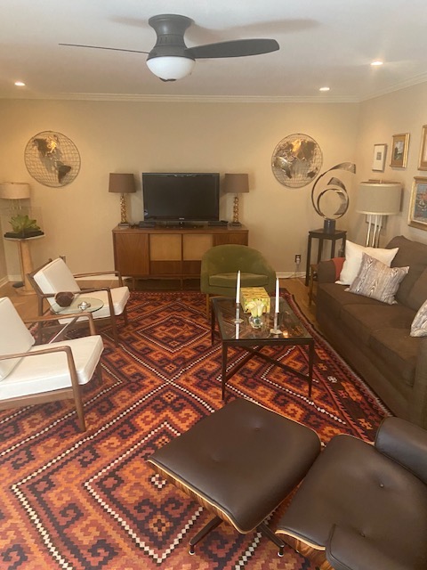
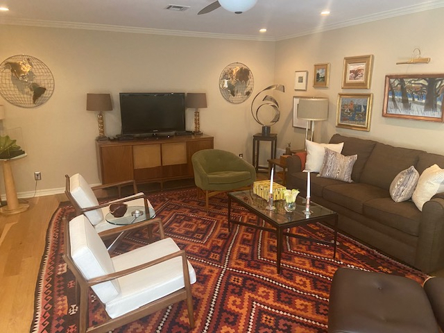
For nine years, a handwoven kilim rug in rich tones and patterns made a dramatic statement and grounded the living room room in warmth. A pair of 1957 Dux white chairs, frequently found in Frank Lloyd Wright designs, are slip-covered in white for summer. “In 1957, they were extremely high style,” says Price. “Georgia O’Keefe had that exact chair in her bedroom in New Mexico.”
The chairs have clearly stood the test of time and are a modern classic today. So when Price wants a new look, instead of changing the chairs, he simply changes the cushions. And voila! The room is subtly altered. (Keep an eye on the barrel-shaped green velvet chair to the left of the sofa, though.)
“Changing the fabric on an upholstered piece of furniture is a simple way to renew the room,” he advises.
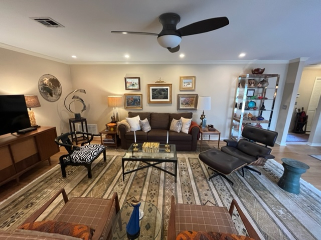
Two: Change a Chair
A view from behind the chairs shows them now with a plaid wool slipcover. But that green velvet chair? It’s been replaced–twice. “I get bored with chairs,” Price admits.
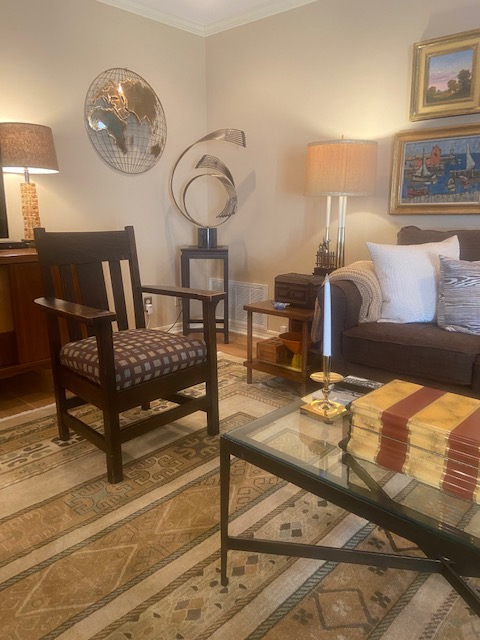
Proving his words, the first switch was to an Arts and Crafts chair with a cushion covered in Japanese kimono fabric. It had a short-lived residence before being exchanged for something with a bit more zest.
Don’t miss all the wonderful mid-century modern touches: the lamp to the left of the sofa is vintage 1950’s from designer Tommy Parsinger.
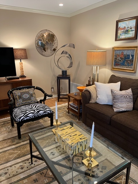
Which chair do you like better? The latest side chair is a 1950’s black lacquer zebra print. Note the unusual throw pillow with semi-precious stones. Price brought the pillow home from a trip to Agra, India, on a trip to see the Taj Mahal.
The chair is by James Mont, known as a notorious figure in American design when he achieved fame as “the designer to the mob.”
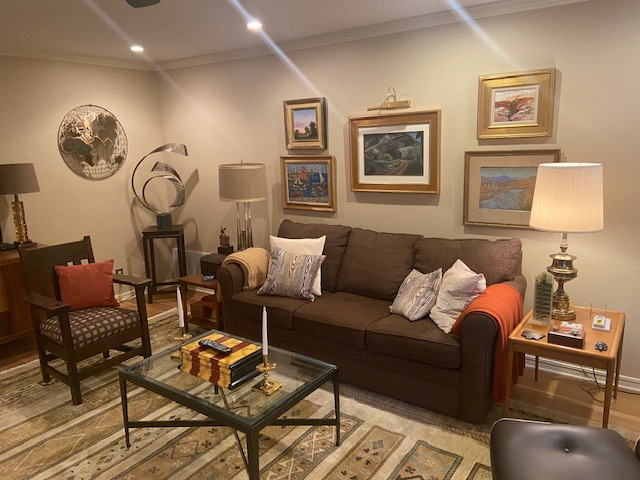
Three: Add Punch with Pillows
A pop of color has been added with a persimmon orange pillow. The pillow and the matching throw on the sofa were both made from Frank Lloyd Wright fabric reproduced for the Price Tower in Bartlesville, Frank Lloyd Wright’s only “fully realized” skyscraper. In addition to his design work, Price works at the Tower and Arts Center in preservation and conservation, as director of tours, as an educator, and as a longtime supporter.
The two end tables by the sofa are circa 1940’s, by John Robes-Giddings.
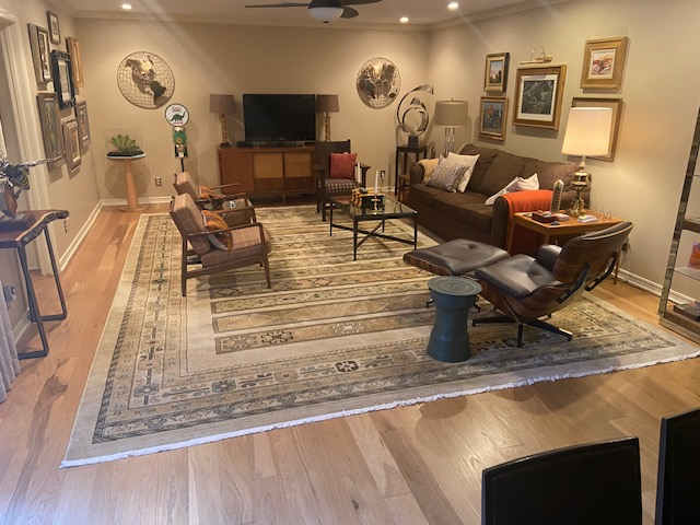
Four: Your Carpet is a Canvas
The biggest change in the room is the lighter, brighter floor covering. This rug represents the Southwestern part of the country where Price and Marty live. The sense of place is reinforced not only underfoot, but everywhere throughout the room. This is a deeply personal space that Price says Marty embraces as well.
Although making changes to a shared home can be a for better or worse kind of challenge, Price is careful to ensure that the home reflects both their tastes and experiences. The lamp to the right of the sofa, a favored Greek key design, once belonged to Marty’s grandmother.
Note the bronze Thai rain drum to the left of the Eames chair. Rain drums are named for the unique sound they make when struck by the monsoon rains of Southeast Asia. Price carried this drum home from the Chiang Mai Night Bazaar in Thailand.
Five: Embrace the Art Movement
In this instance, Price doesn’t mean a school of art or philosophy, but rather, don’t be afraid to move things around.
“Changing your art –either rotating new pieces in or just changing their location–also gives the room a new look,” Prices says. Years of collecting treasured pieces has given him ample choices throughout his home. “Marty never knows what home he’s walking into,” Price laughs.
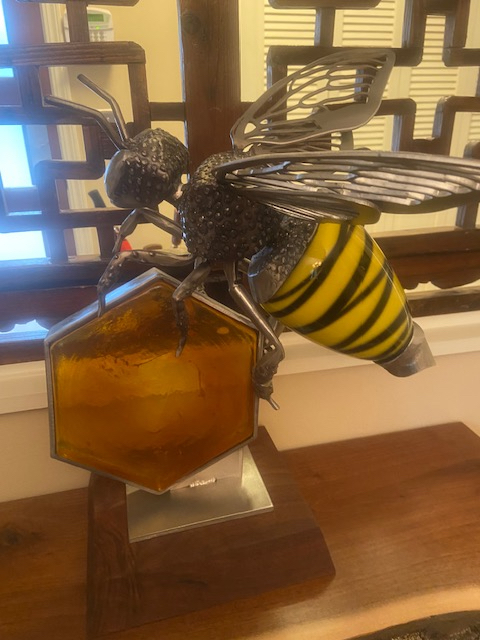
This bee is a commissioned piece from artist Amie Jacobsen in Independence, Missouri. She created this very special sculpture for Price in hand-cast glass and stainless steel.
Six: Tell a Fascinating Tale
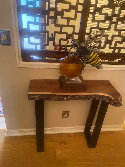
Every piece in this home has a backstory, as befits a lifetime spent collecting meaningful objects. This black walnut table with a live edge, Price explains, came from a company in Kansas City that reclaims fallen trees and makes them into furniture instead of chopping them up. Marty had a welder in Bartlesville make the legs as a birthday present for Price.
What was once a solid wall is now a 19th century Chinese window screen. Placing it in that space opened up more light in the room without giving up any privacy.
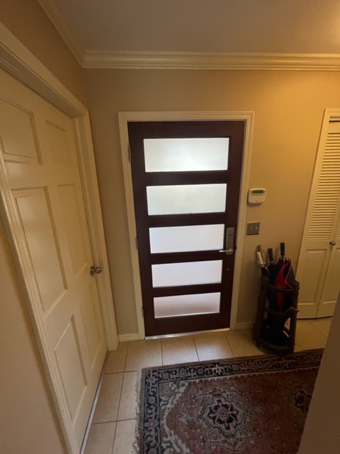
Behind the screen? The front door, designed by Price from solid redwood, and adapted from a Frank Lloyd Wright design.
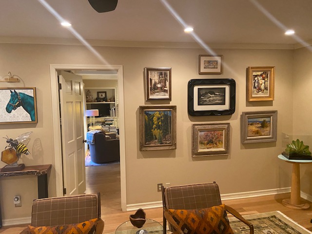
The art on this wall frequently changes. Note that the bee and black walnut table has moved its location– and is now positioned beneath another commissioned piece, a horse painting by the artist Robert Peterson who served as the Artist-in-Residence at a recent Price Tower Gala.
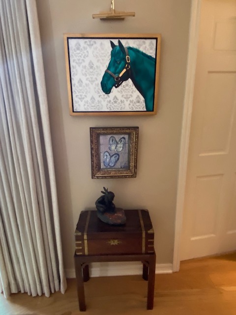
A closer view of the horse painting. Price noted that Robert Peterson has painted portraits for the new African American postage stamps, and is now represented in several museums. Price particularly likes this artist’s backstory: “He only began painting in his 30’s. He was working in a factory, and now he’s a world famous artist.”
Directly beneath the Peterson artwork is a painting of butterflies by Hunt Slonem, purchased at the Quidley & Company Gallery on Nantucket. The antique frame was selected by the artist.
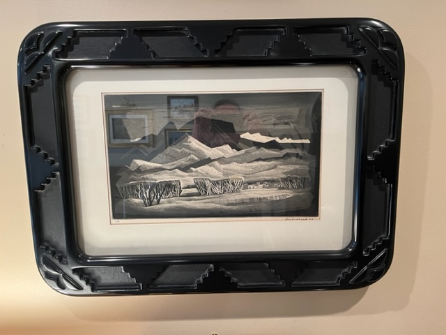
Seven: Cultivate a Sense of Place
Part of Price’s passion for collecting is fired by artists who interpret the history, landscape and beauty of Oklahoma, and the southwest. His deep collection of mid-century modern furnishings make it clear that he believes in timeless beauty and classic design. The regional emphasis of his art is no accident, either.
Another beloved piece: the Doel Reed print in an original hand carved mahogany frame. Doel Reed is a well-known printmaker in Oklahoma and New Mexico, continuing Price’s commitment to collecting the work of local artists and craftspeople.
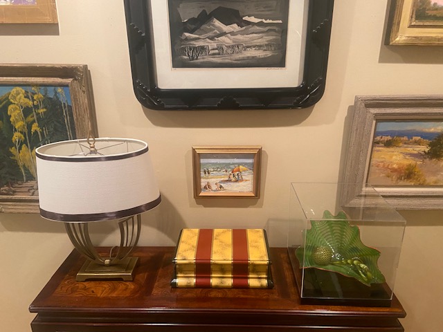
Underneath the Doel Reed print is a Dale Chihuly glass piece, and a striking box circa 1970’s from Karl Springer. These pieces move from location to location, too, giving the room and the art a fresh look and perspective.
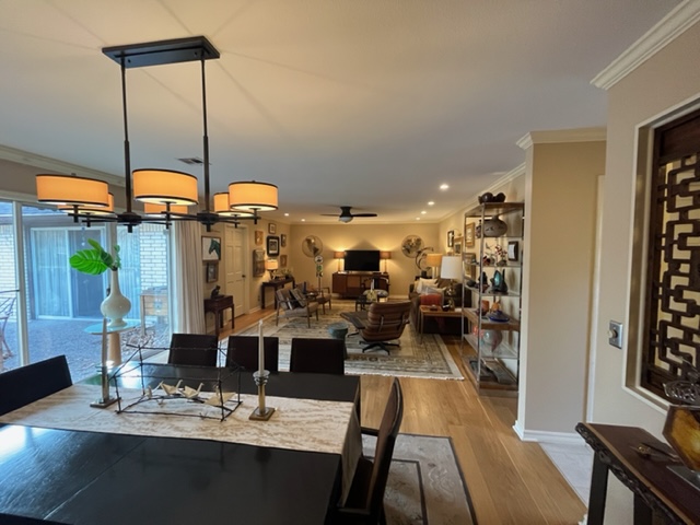
Eight: What’s Old is New
Everything in life, including architecture, design, and furniture, has been built on what came before. As the Bible says, “There is no new thing under the sun.” Don’t be afraid to seek out items that have had a life in another place and time. If there’s a particular time period or design style that interests you, study it so you can recognize form and function, clean lines and fine design. Or hire a designer who’s made a study of design principles his life’s work, as Price has.
This view shows the dining room looking across the open space to the living room. The mid-century modern look continues here with a dining table and chairs circa 1965, from the John Widdicomb Company.
“I found this set years ago in New Jersey. All the fabric on the chairs is original as the older couple who owned this set kept the chairs covered in plastic,” Price says. “The table has three leaves that came in their original boxes: they had never been removed.”
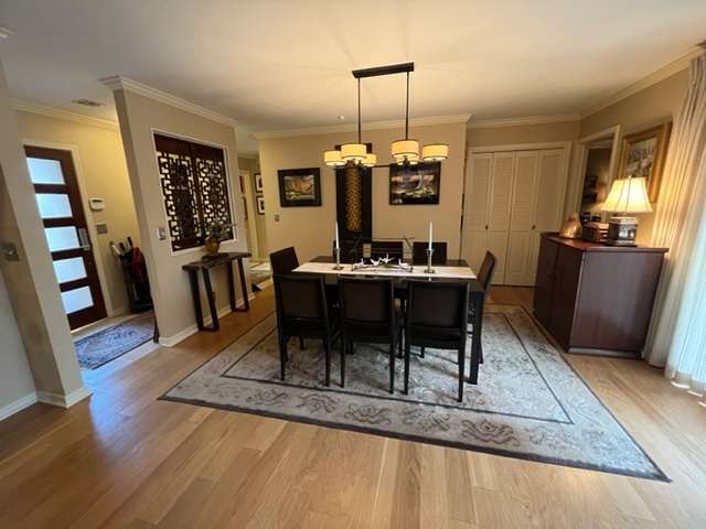
Behind the dining room table is a vertical piece of artwork by a Brazilian artist, created with tumbling blocks of wood. The two watercolors are by another local Oklahoma artist, a teacher at the University of Oklahoma and a student of Doel Reed. More local art celebrating the richness of life in Oklahoma!
On the right is a 1940s radio cabinet, also designed by the infamous James Mont.

Price Connors
Happy Decorating!
Did you enjoy this blog post? If so, feel free to share it with your friends!
Watch for my new blogs once every other month, and Instagram (@dujardin_design) and Facebook (@DujardinDesign) posts on Thursdays. Once a season I send a newsy email letter to you, too! Be sure to subscribe to get all the best design advice and beautiful inspiration through photos of our projects. I want all of us to live in happy, well-designed, healthy homes!
Trudy

