My work as an interior designer has taught me how to edit. There is a world of beautiful colors, furniture, accessories, artwork and things that a designer can choose from. The process of saying yes to this and no to that is not very much different from how each of us must live our lives, choosing what to let in, and what, sometimes regretfully, to decline.
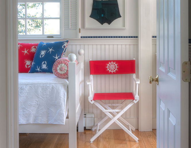
When I’m at my Nantucket home in Madaket, I’m aware of editing my surroundings for function, comfort, and beauty. This is both a preference as well as a necessity, as my husband, Frank, and I have consciously chosen a beach cottage lifestyle there. We truly embrace the “less is more” experience after years of living in larger, grander homes.

Our fisherman’s cottage by the sea is just the right size for the two of us, plus my dad, Bob, and our three darling Bichon Frises, G.G., Tuffy, and Ellie, who go everywhere with us. (With Bichons, more is definitely better.)
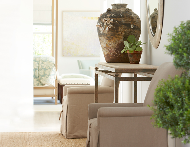
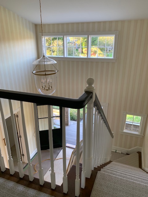
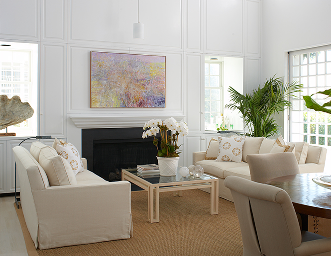
Editing is a crucial responsibility of an interior designer no matter what the size of the home. A common mistake made by homeowners is to look at furniture, lamps, and artwork, and to see them individually, without considering the space around them. A credentialed interior designer, however, sees things differently. When I enter a room, I see a frame –the boundaries of a room, the positive space –space that is occupied, and negative space –where the eye can easily rest. Every room needs space for the eye to rest, but the question is where, and how best to use it.
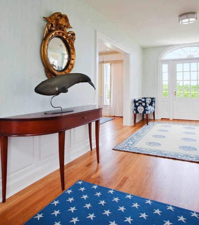
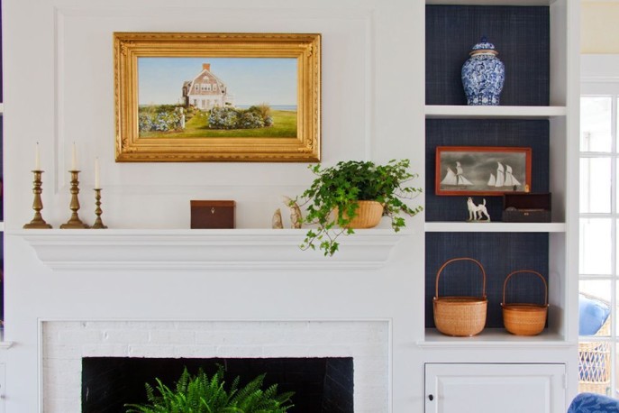
Rather than thinking of negative space as open space to be filled, negative space is integral to making a room interesting and alive. You can work with negative space when you group furniture together, or place a collection of objects on a shelf. My eye can see a rhythm between one item and the next, something not everyone can do. I often think that my training as a fine artist was critical to developing my interior design aesthetic.
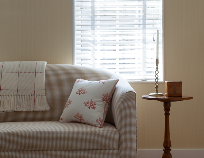
Juxtaposing one shape next to another creates one kind of negative space, as does placing items in symmetry versus asymmetry.
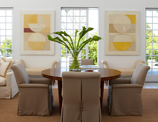
Color is powerful, evoking emotions we are not always aware of when we enter a room. I love to use white plus one color, often hues from the sea. Blue, seafoam green, and pale shades from nature are soothing when used with white.
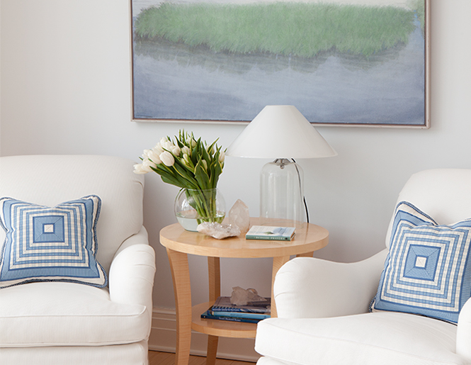
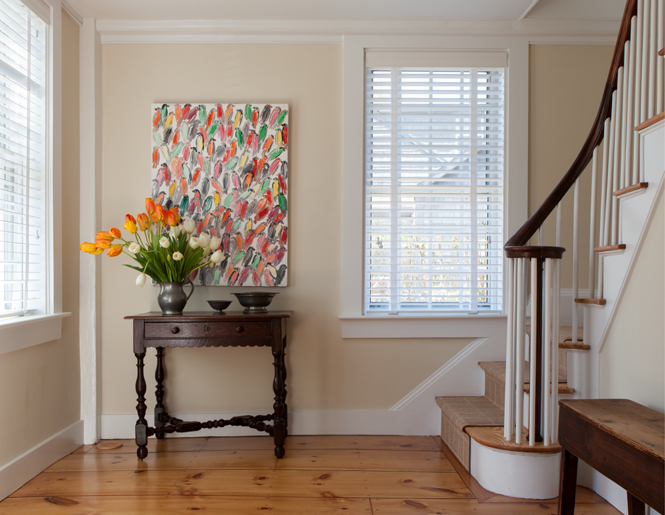
What to place on a tabletop is another way to experience the power of less. Too many items can quickly become a cluttered mess that creates disharmony. Groups of items must be carefully considered for their impact on each other, especially when they are of disparate size or color.
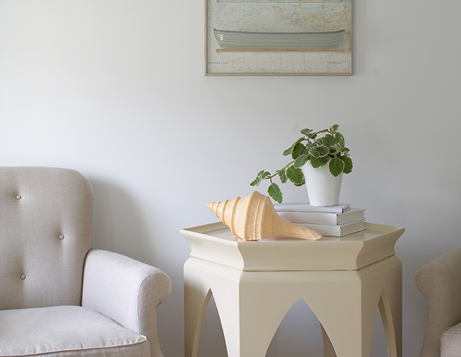
One of my professors impressed upon me the importance of saving something for the next room. You don’t need to show everything you know in one room. Excellent advice that I have used time and time again!
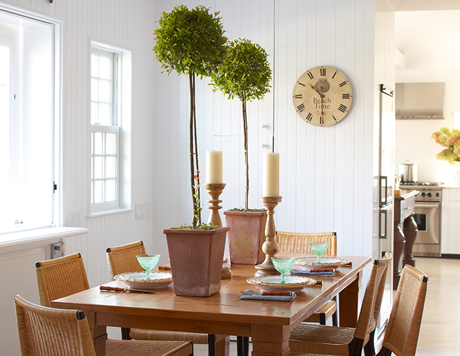
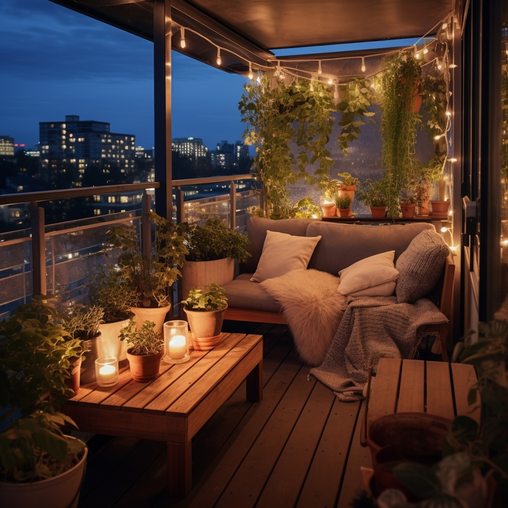
Letting a room have space to breathe doesn’t always come easily, another reason an educated designer can be your home’s best friend. There are rooms that make us feel stressed and constrained, and rooms that make us feel expansive and relaxed. It can be difficult to see why each has the feeling it does, until you begin taking objects away.
Suddenly, there is peace. And we can never have too much of that.
