As the last weekend of summer approaches, it’s time to pack up the beach chairs, the straw hats and the lobster pots, and return to our busier, bustling lives in the city. In honor of returning to our primary hearths and homes, we’re taking a look this week at an agelessly elegant pre-WWII apartment in Manhattan. Richer colors, the warmth of heavier upholstery and textiles, and the sheen of polished dark wood are all gently tugging at us now, calling us back to a new season.
When the history, glamour and style of a prewar hotel turned condominum was chosen as a New York City home by a client moving from warm and sunny California, we envisioned a careful renovation to both honor its past and bring new and polished life to its rooms. The three bedroom, three and a half bath apartment is located on the Upper East Side in the former Westbury Hotel. My team’s task was to create a perfect city retreat in the recently converted space, while retaining the elegant feeling of the 1930s and 1940s. The usual prewar amenities, such as gracious architecture, high ceilings and fireplaces were not all present in this space, due to its previous life as a hotel. So it was up to us to add the missing period architecture, as well as the dash and style that represented the owner’s contemporary lifestyle.
ENTRY
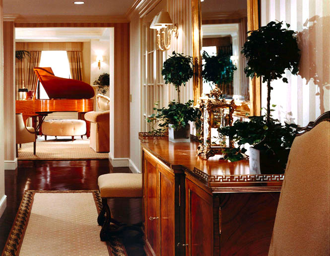
A mark of many prewar apartments is a spacious entry. Its ample size needed to be balanced with appropriate details, so we added prewar flair to this space, including gracious French doors, flanked by sidelights, opening into the dining room. The walls are covered in smart silk-stripe wallpaper, establishing an aura every bit as sophisticated as Myrna Loy and William Powell sipping cocktails in a 1930’s movie. The piece on the right is a wonderful example of faux bois done by the Isabel O’Neal Studios, well known in the design world for her wonderful painted finishes. At the far end, this grand entrance gracefully opens into the living room.
LIVING ROOM
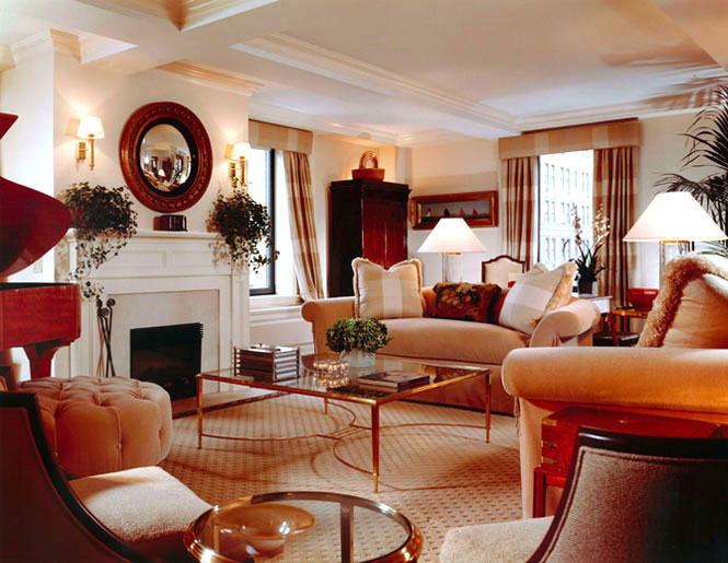
We added a fireplace to bring a focal point to this room, and brought the draperies up to the ceiling to make the ceiling feel higher. The room is anchored by a Steinway’s Great Estates piano, a special Limited Edition made of satinwood. A longtime signature of Dujardin style is adding antique pieces for warmth and beauty, along with reflecting the client’s love of special places. This room houses several antiques, including an elegant German Biedermeier armoire. The painting and the nest of Nantucket Lightship baskets is an homage to the client’s love for Nantucket Island. California comfort is found in the overstuffed sofa, and in its generous proportion and size. Contemporary lamps and sconces make the room truly timeless. The room’s warm golden tones remind the client of her years spent in sun-splashed California.
DINING ROOM
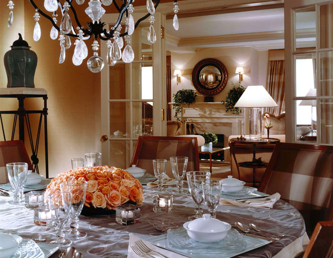
The formerly closed off dining room was opened up to the living room by taking down a wall, then adding French doors flanked by sidelights. There is another pair of french doors leading to the entry way, allowing the room to be enclosed for private dinner parties. Upholstered silk walls create a quiet atmosphere for intimate gatherings with friends. The chandelier of wrought iron and rock crystal is a nod to the more casual California dining the owner also enjoys. Chairs here are amply sized to provide comfortable seating, as the scintillating dinner conversation often goes straight through to brandy and dessert.
BREAKFAST AREA
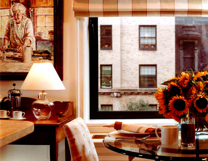
This charming tableau is a rarity in New York City: a true eat-in kitchen. The country Chippendale desk, while functional, adds a subtle touch of Nantucket style to the room. The painting above, showing a woman baking, quickly became one of the client’s favorites, as it reminds her of the many hours she spent in her grandmother’s kitchen. It’s that kind of close attention to details from our clients’ lives that gives our interiors the true warmth and feel of home. I believe in a clean and serene aesthetic, and in honoring the architecture of the past when a home is redesigned for life in the present. This vintage space, brought to fresh contemporary life, shows just how it can be done.

