

“Work, travel, save, repeat.”
I’ve been traveling through France and Italy recently, celebrating a belated tenth anniversary with my husband, Frank. We engaged the services of the talented Janet Simmonds from the Grand Tourist, (she writes a fascinating blog she calls the Educated Traveller –British spelling!) She put together an itinerary for us that moved us from Southern France, beginning in Beaulieu-sur-mer to Venice, Italy, with elegant meals, private tours, and spectacular sights.
I found design inspiration everywhere–in the food, languages, colors, architecture and interiors–and I want to share my inspiration with you. I thought we’d begin with France, since that’s where we went first.
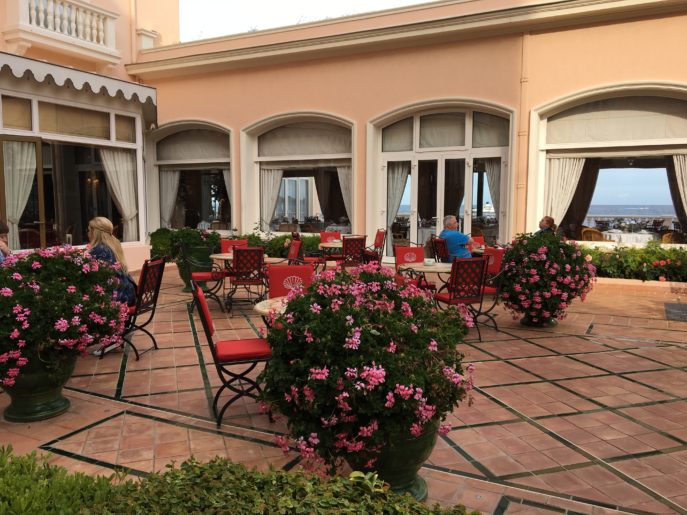
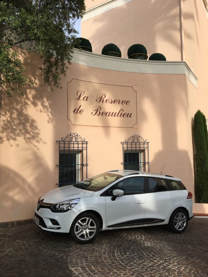
The creamy tones of the La Reserve Hotel got our trip off on a calming note. The bright pink roses that punctuated the patio were the perfect compliment, and added life to the scenery.
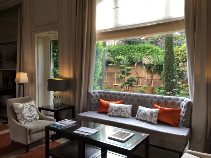
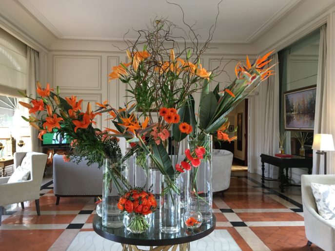
Indoors, the coral exterior evolved into dazzles of orange with grey and taupe. It reminded me of a favorite project I did for an Hermes orange loving client in Manhattan. Here’s my take on orange and neutrals, below:
Orange is eye-catching in floral arrangements, too. Both across the room…
…and close up!
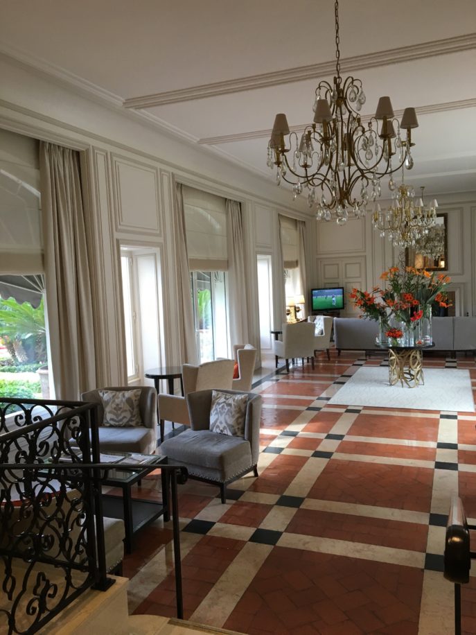
We loved our room, which was a delightful blend of old and new. I loved how the interiors of La Reserve combined contemporary furnishings with priceless antiques, which adds such depth, warmth and richness! Much more interesting, I think, than all modern, which doesn’t take a location’s history into account.
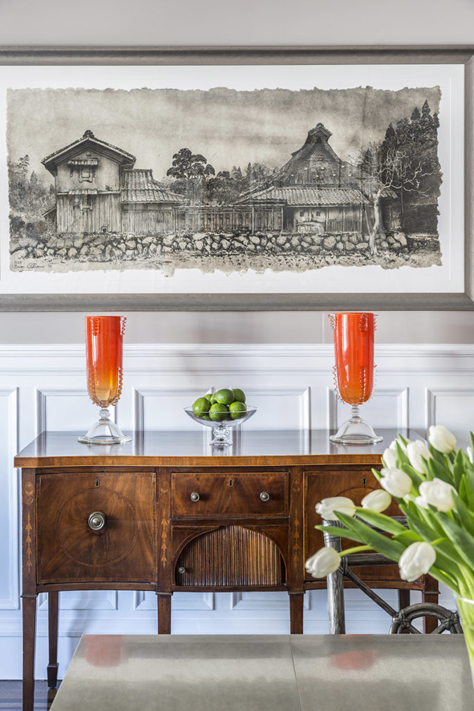
The thread of good design holds true throughout the ages. Good design from the 18th century can play off good design from the 21st century. Here’s an example from my own design work, below: an 18th century buffet against 21st century lacquered walls. This is in a Manhattan apartment.
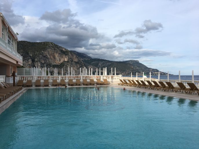
Meanwhile, there were no complaints about the shades of blue that met us in the pool and sea outside our door.
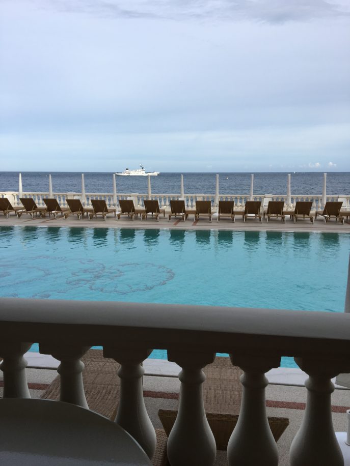
The saltwater pool was heated, and free of chemicals.
Wandering through the charming medieval town of St. Paul de Vence meant finding history of more than 1,000 years at every turn. In the 20th century, artists began coming to St. Paul to paint its famous brown stone buildings in the silken light of southern France.
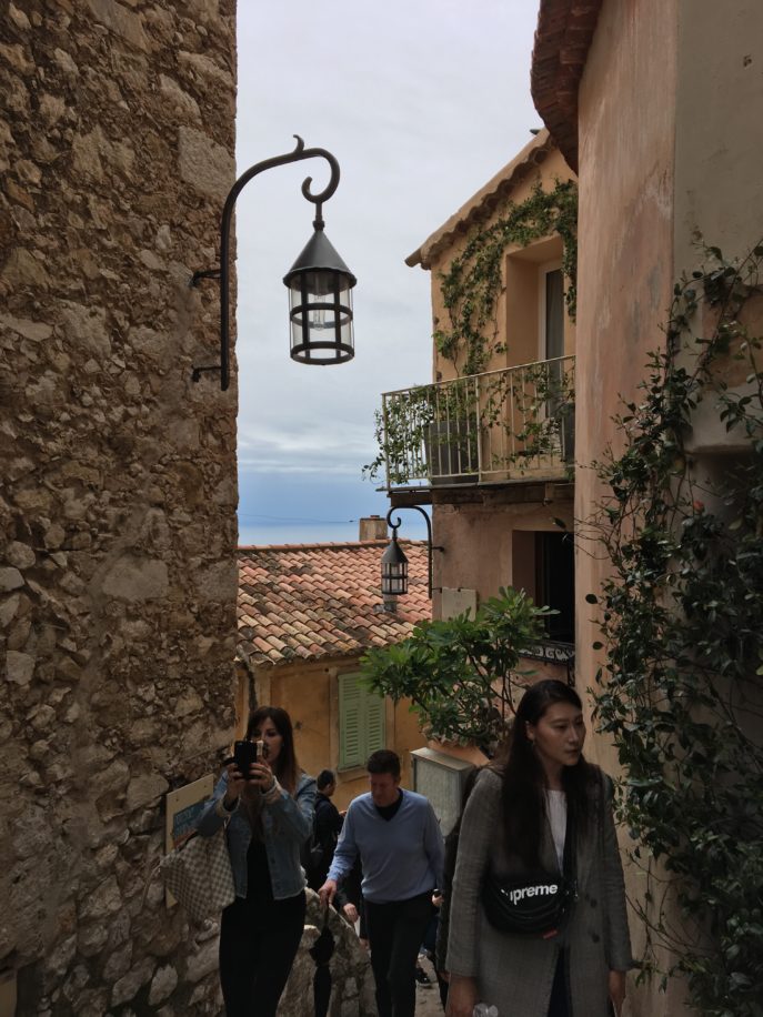
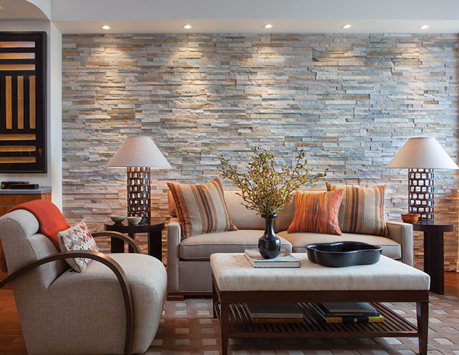
As we walked through St. Paul, I couldn’t stop thinking about the rustic stone, and how that might translate into a modern home. Using natural materials is simple but stunning in its impact. Natural stones are endlessly elegant and eco-friendly. They bring a richness of texture and color to a room.
Here’s another of our Dujardin designs in Manhattan, where we used rough stone to create a dramatic backdrop to the sleek-lined furniture. We used antique horse blankets to cover the pillows–unusual materials and unique applications make an interior innovative!
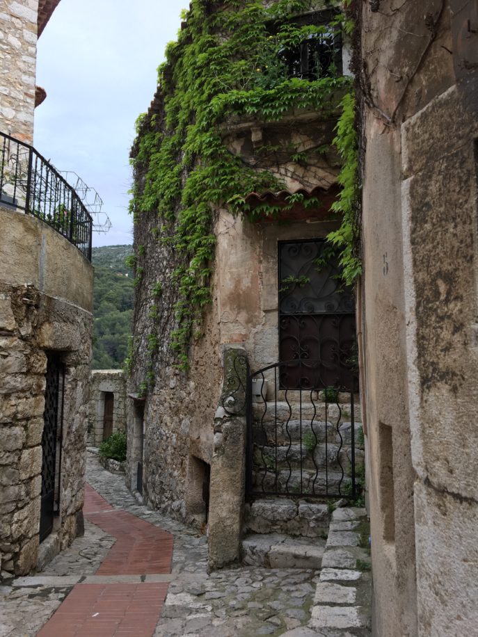
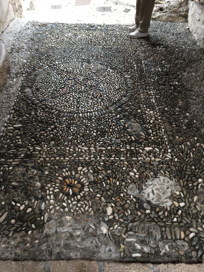
Back in St. Paul, I was struck by how a mosaic of small stones could be one way to add movement and depth to a space, and offer many natural hues to work with.
Next stop: the bar at La Colombe d’Or, where we had an aperitif before dinner. The rough stone walls with muted colors depicting leaping stags was a masculine touch.
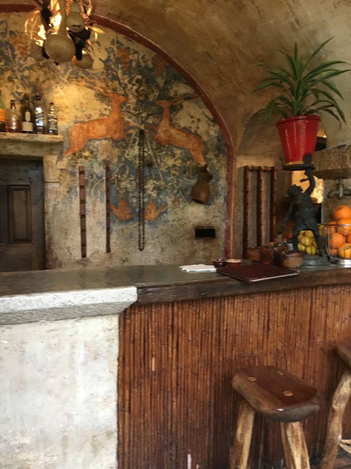
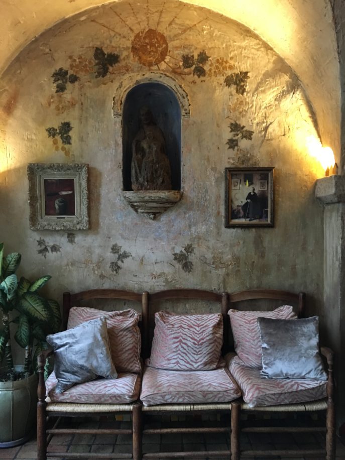
Aged paint on stone walls paired well with these surprisingly glitzy silver pillows.
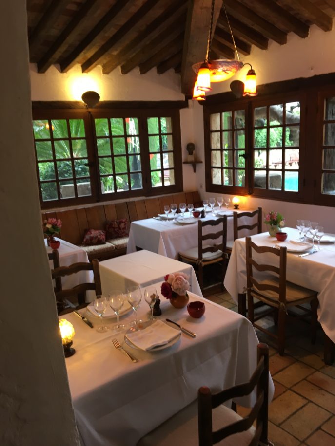
The beautiful dining room at La Colombe d’Or, where Frank and I enjoyed our much delayed anniversary dinner–at last!
The simple stone building was once a weekend haunt for artists.
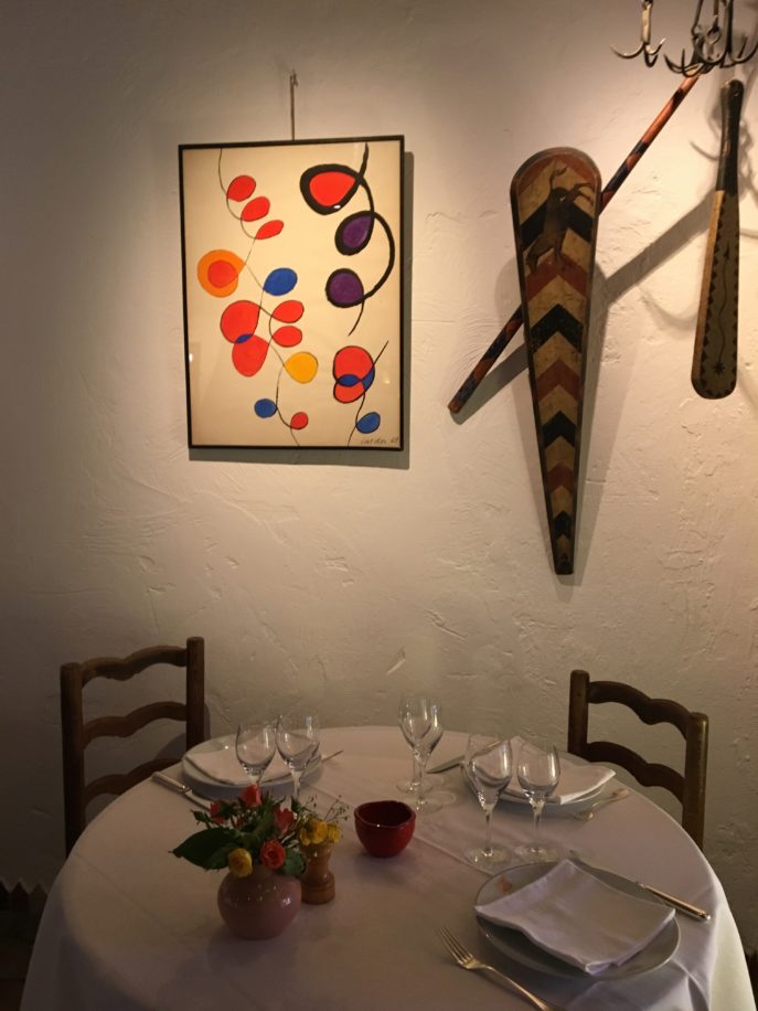
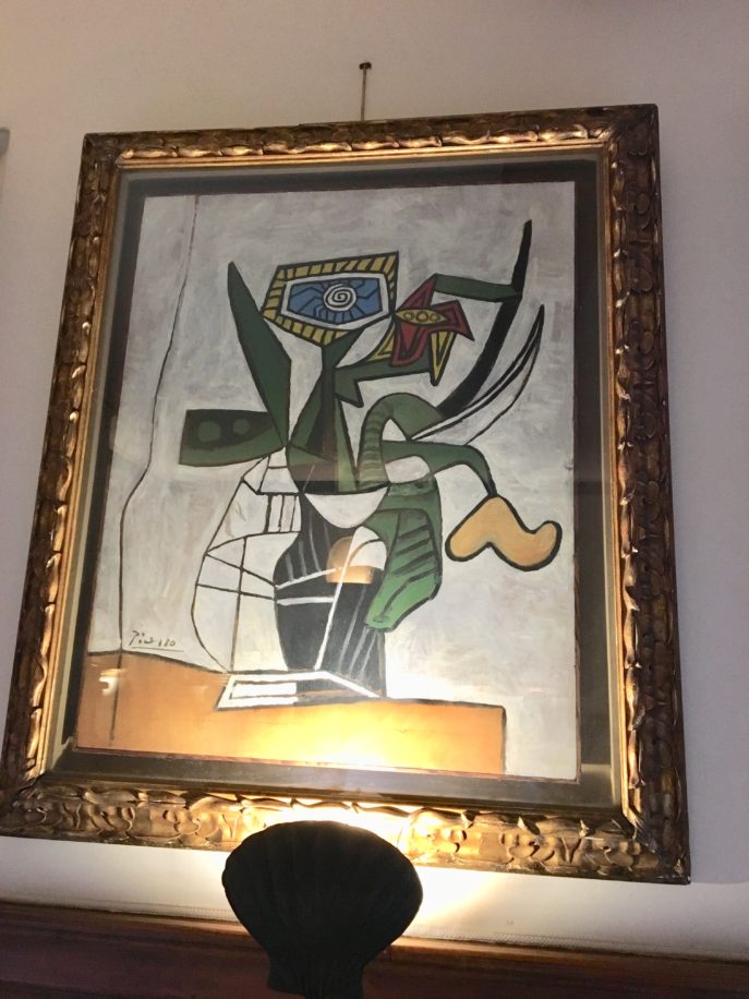
It’s still filled with their artwork–incredible pieces by Matisse, Miro, Calder, Picasso and Chagall.
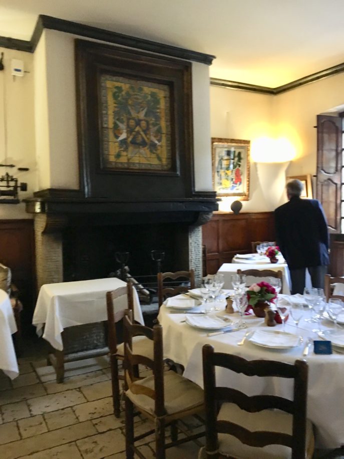
Imagine eating dinner in an art museum, with comfortable surroundings and delicious food.
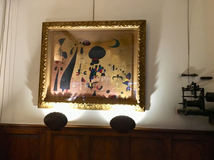
Everywhere you turn, there is priceless art.
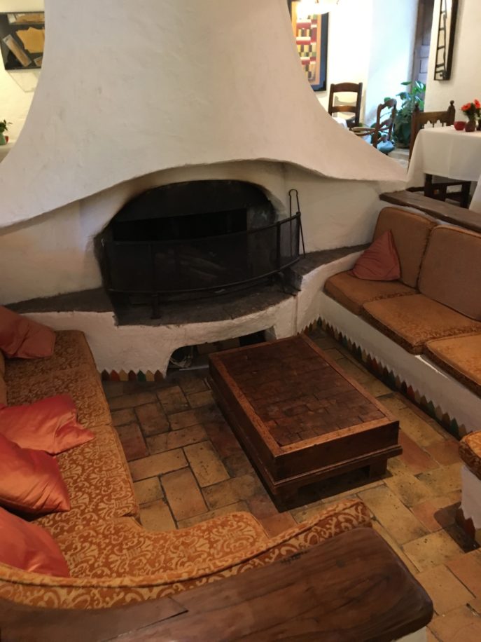
Anybody interested in a fireplace with a sunken gathering area? Winters in New England seem to require one of these. The placement of the seating would concentrate the heat nicely while enjoying a brandy after dinner.
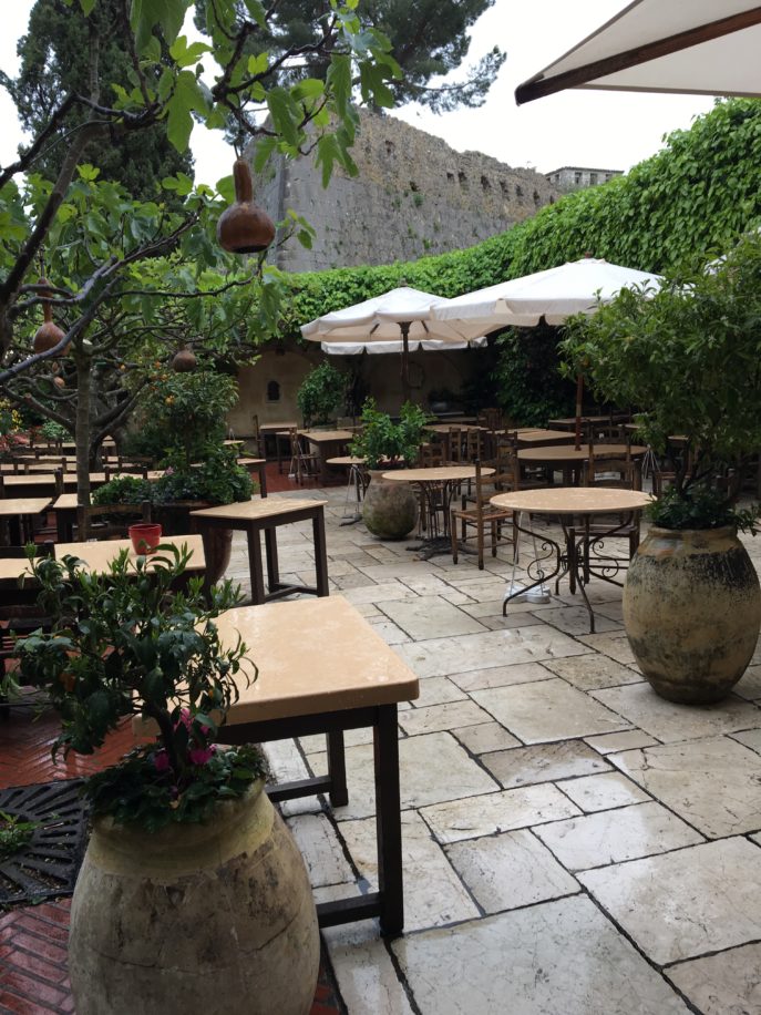
No one was eating outdoors, but aren’t these weathered urns planted with greenery just gorgeous with the stone tile floor?
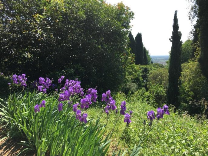
Colors aren’t limited to artwork, as you can see in the purple irises growing in the field.
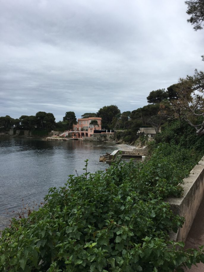
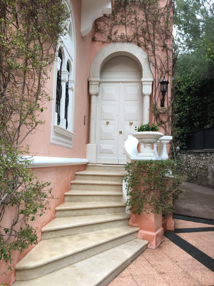
This quiet beauty in pink and white is the former home of David Niven, the British actor. We took a walk from Beaulieu-sur-mer to St. Jean Cap Ferrat to see the house. One scene from Niven’s last movie–the Pink Panther–was filmed there in 1983, the year before his death.
Gold doorknobs on the white door are the perfect accent. Pink and gold and white is stunning.
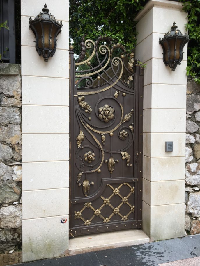
An ornate gate that simultaneously invites you in and says, “not so fast! Are you invited?”
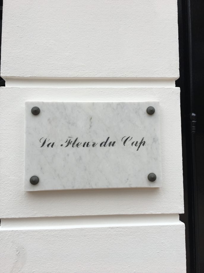
A marble sign with the name of your home is always elegant. Especially if you’re David Niven.
We’ll be back soon as we continue our journey to Italy! Come along with us next month. I have so much more to show you!