“Though we travel the world over to find the beautiful, we must carry it with us or we find it not.”–Ralph Waldo Emerson
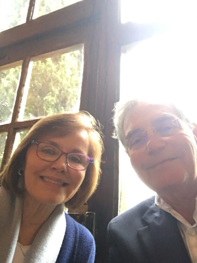
In my last post about my travels to France, I shared the places I went, delighted with how they inspired me in my work in interior design. My trip didn’t stop at the border of France, however; my husband, Frank, and I continued on into Italy. And the longer we were away, the more I thought about how it is that beauty can inspire us not only in the design of our homes, but also in the design for our lives.
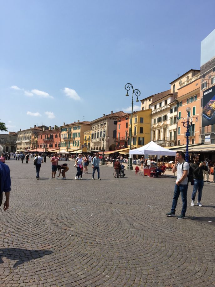
As a fine artist who became an interior designer, something I loved in Italy (and in France) were the beautiful colors. In Verona, the buildings were a perfect foil for the brightly shining sun with their citrusy shades of tangerine, gold, pale yellow and sunburnt red. Life lesson: the world is a colorful place!
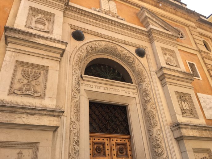
All the colors of Italy are subtly glorious. This old synagogue in what was once a Jewish ghetto shares the golden tones of the buildings in Verona, but it also inspires awe, as religious buildings are meant to. You must look closer to see the many intricate designs that proclaim it a Jewish house of worship.
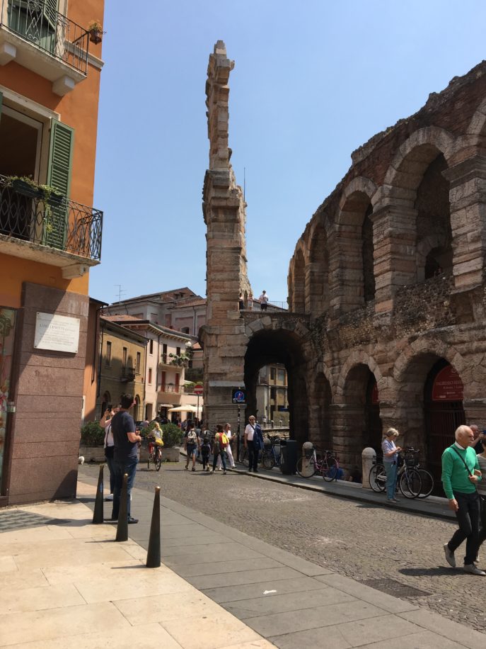
Looking closer is one of the requirements of travel. At first glance, we see the bigger picture: the architecture, the ruins of this ancient amphitheater in Verona, the cobbled streets. It is only when we look closer that we see the faces of the people, their smiles, what they carry, who they are. (An earthquake in 1176 destroyed the amphitheater here; this is the only remaining fragment of the outer ring.)
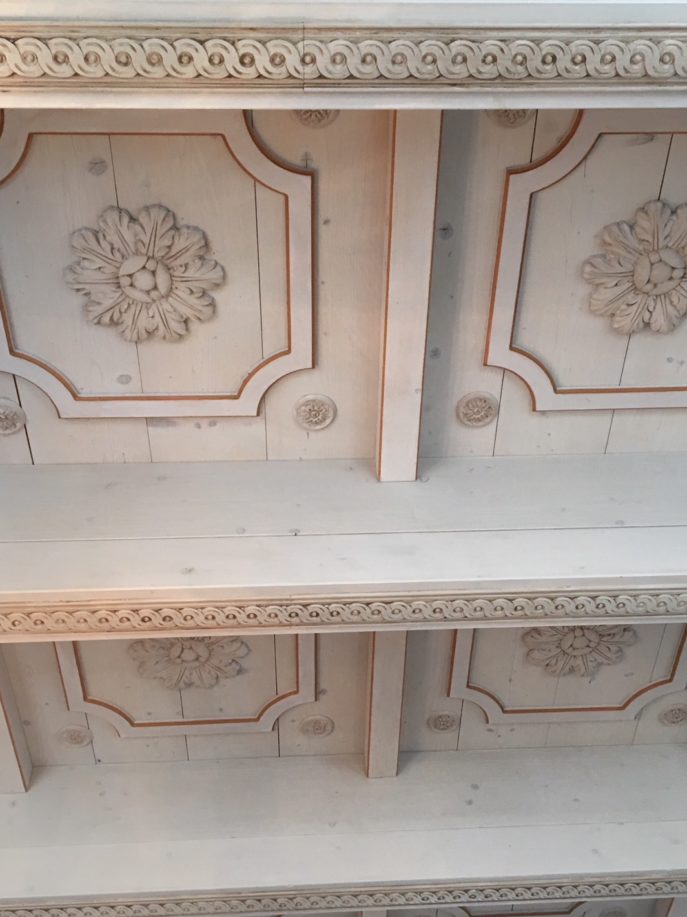
Close attention to detail is also a requirement for an interior designer. Details bring a room to life, give it movement, personality and that elegant je ne sais quois. The ceiling in the breakfast room at our hotel in Villa Cordevigo near Lake Garda reminded me of both an important design rule, and one for living: lift your eyes. Look up.
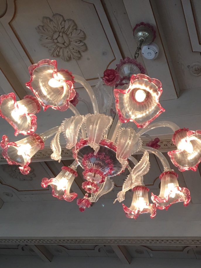
The Murano glass chandeliers there were a source of light and delight. Shouldn’t every light fixture be both? I think so!
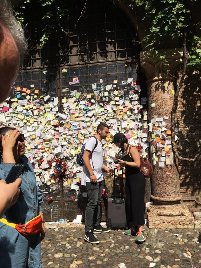
Italian is known as the language of love, and Verona is known as the City of Love. Romance is celebrated where Shakespeare set his story of star-crossed lovers. Romeo and Juliet, sadly, were based on a real life feuding family. Today, people in search of love, forgiveness, or who simply want to celebrate their own unique love story write letters and leave them here. The city of Verona receives over 5,000 letters a year to Juliet.
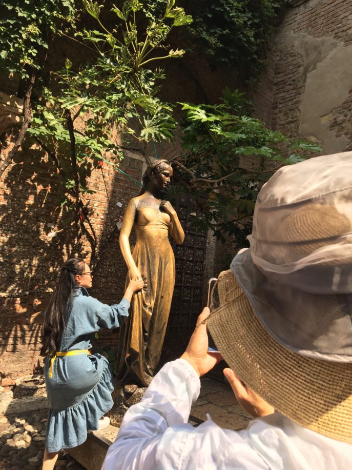
The statue of Juliet is said to be good luck to lovers. When the original bronze statue, cast in 1969, was removed for repairs, restoration staff found hundreds of letters from star-crossed lovers that had been squeezed into the statue through cracks in the exterior. In addition to notes, there were tiny padlock keys. Couples often buy padlocks, write their names in indelible ink, then either hide or throw away the key.
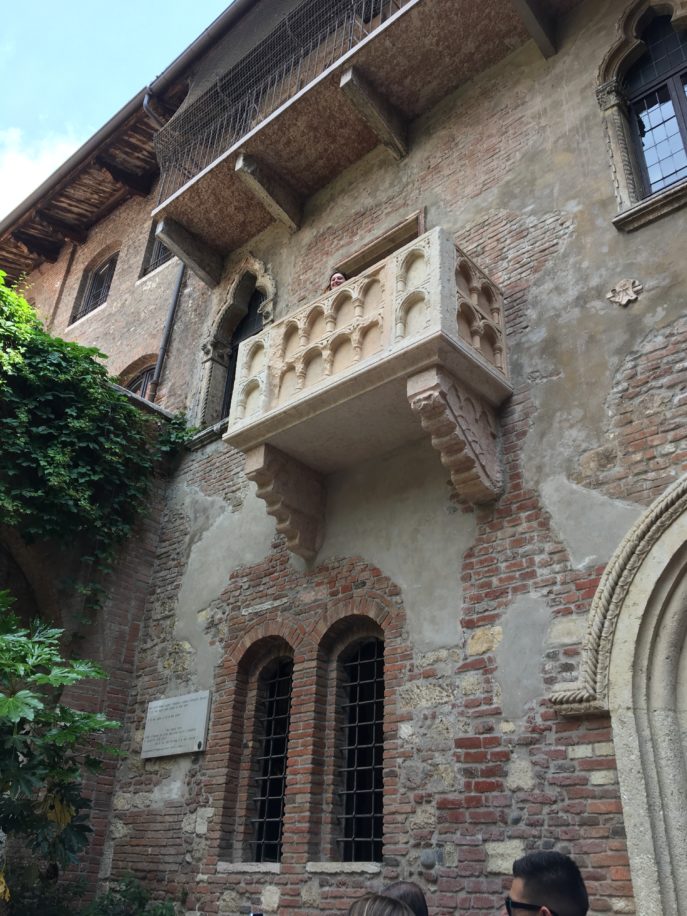
People come from all over the world to stand beneath Juliet’s balcony. Don’t you love the symmetry of the Romanesque windows underneath?
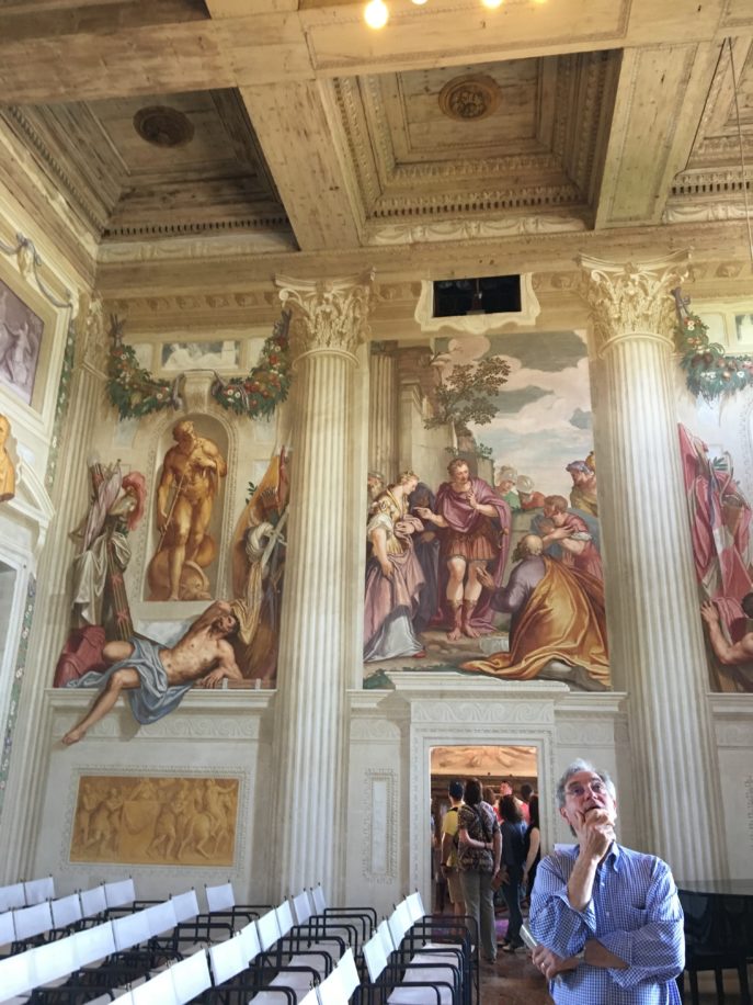
We saw many villas designed by the 16th century architect, Andrea Palladio. Palladio based his work on a study of classical Roman architecture, which gives much of the region its unique appearance.This is Villa Emo, designed by Palladio in 1559. It remained in the Emo family until it was sold in 2004. The landscape has a continuous history since Roman times, and it has been suggested that the straight lines of the villa reflect the straight lines of Roman roads.
In the land where the Renaissance began, with a culture and architecture heavily influenced by the Classical ideals of Greek and Roman civilizations, rich detail can be found everywhere you turn.
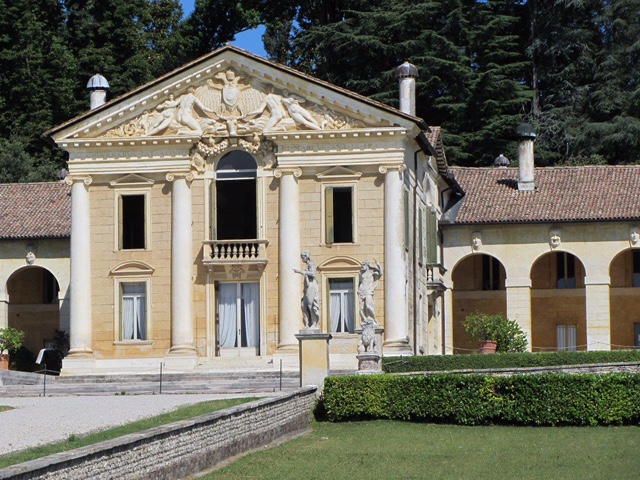
Villa Barbaro, also known as Villa di Maser, was built by Palladio for Daniele Barbaro, ambassador to Queen Elizabeth I of England, and his brother, Marcantonio, ambassador to King Charles IX of France.
The frescoes in Villa Barbaro are by the artist Paolo Veronese. He painted the wife of Marcantonio Barbaro, Giustiniana, along with her youngest son’s wet nurse, her parrot, and her spaniel dog.
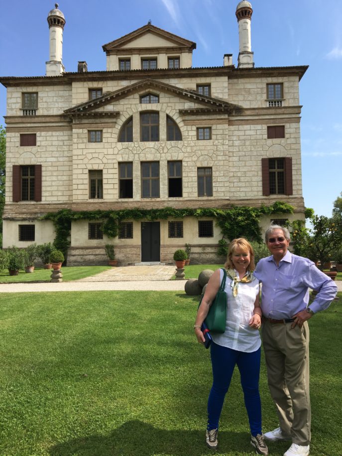
Here is our tour guide, Janet Simmonds, with Frank, standing outside the Villa Foscari, also known as La Malcontenta. In the 16th century, rich patricians of Venice had villas built to expand their empires through agriculture. (The name La Malcontenta has several explanations, all hinging on a supposedly unhappy wife many years ago.)
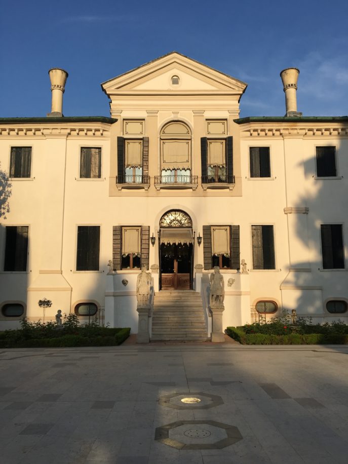
We stayed in one 16th century villa, the Hotel Villa Franceschi, the former residence of jewelers to the Doge (the Italian chief of state). The villa stands at a bend in the River Brenta, and is the gateway to Venice.
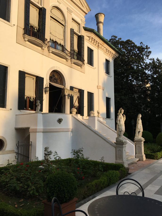
The end of day is always a favorite time for me, when the sun begins its descent toward the horizon, and gently slants against the buildings. The quality of light is different in different locations. I’ve always found sunlight on Nantucket to be especially luminous. I love the sunlight in Italy, too.
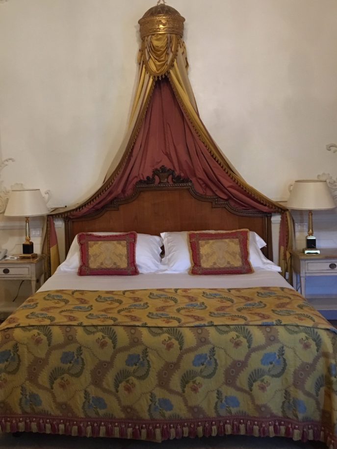
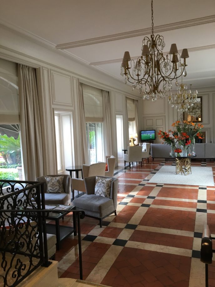
This is our room at the Villa Franceschi. The guest rooms are opulent, with marble fireplaces and terra cotta floor tiles, and the ceilings have their original wooden beams. It’s important to revere our history, and restore our ancient buildings. I felt the same way when I restored a sea captain’s house on Nantucket years ago.
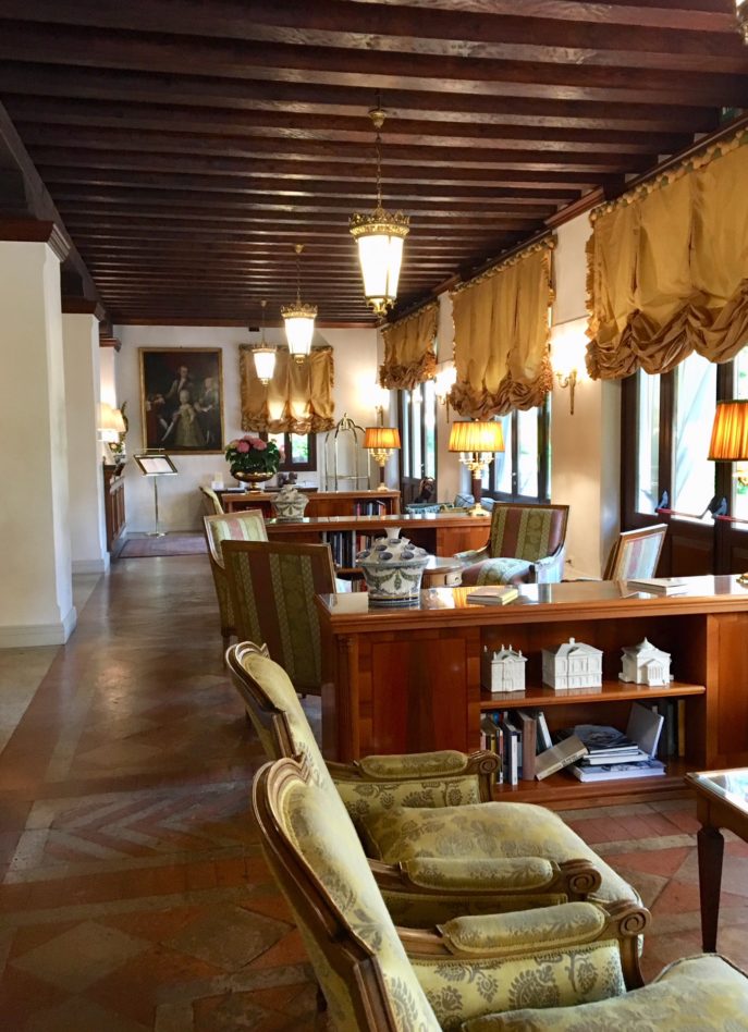
I have always found a mix of old and new, layered throughout a home, to give both grace and grounding to the interiors I create for my clients. I came home feeling more strongly than ever that in a home with a modern look and feel, there is still room for antiquities and fine antiques.
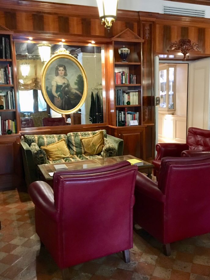
Many of my clients have inherited pieces or vintage collectibles that they want retained in their homes. By combining new with old, a recently decorated room has the look of one that has evolved over the years. The end result is a cohesive blend of style and comfort, as it is here at the Villa Franceschi.
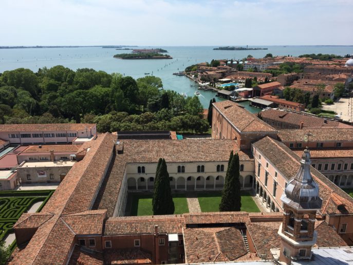
You find symmetry, balance and order throughout Italy, including in formal gardens, as in the maze at the abbey of San Giorgio Maggiore.
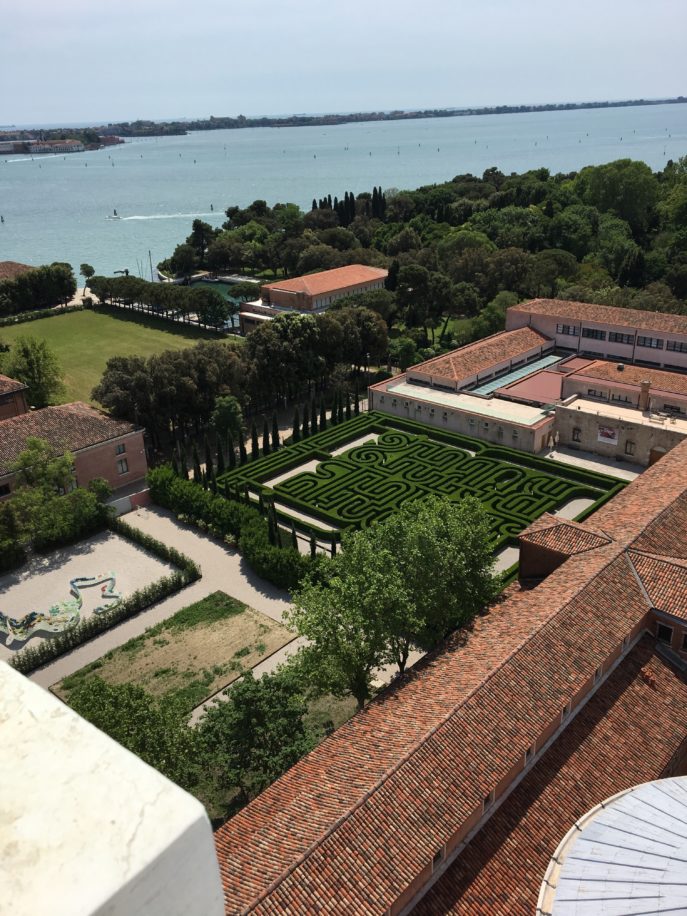
Also called the Borges Labyrinth, it was created in honor of the Argentine writer Jorge Luis Borges, to recall one of his best known stories, The Garden of Forking Paths. Because Borges became blind at age 55, a handrail was installed so blind people can walk the maze without assistance.
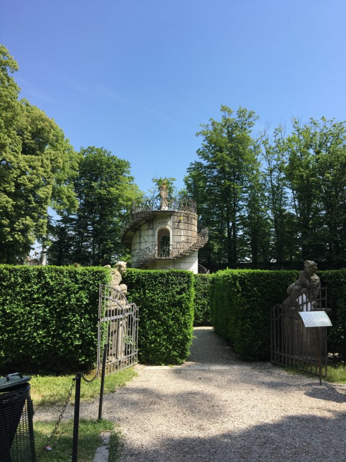
Italian gardens are beautiful, with or without a maze. There are many paths to follow, as in life. Since we can’t do everything and be everywhere, we have to choose which ones to walk.
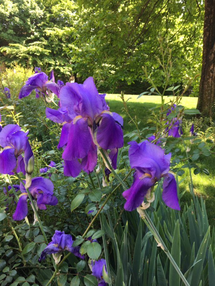
Let’s walk toward beauty.
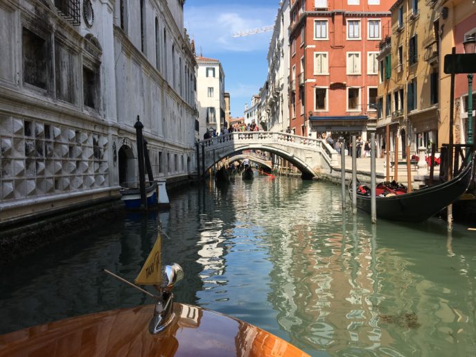
I’ve always been drawn to the beauty of water, and the end of our trip found us floating through the canals of Venice, following the same route George Clooney took with his bride Amal following their Venetian wedding. That was only fitting for a trip planned to celebrate our fourteenth wedding anniversary!
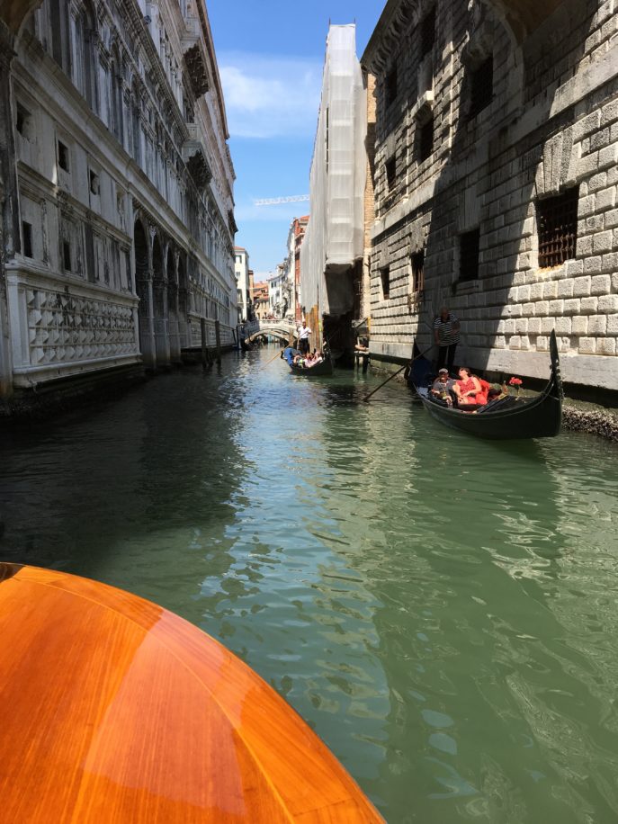
Janet arranged a private boat tour for us, and it was a magical day.
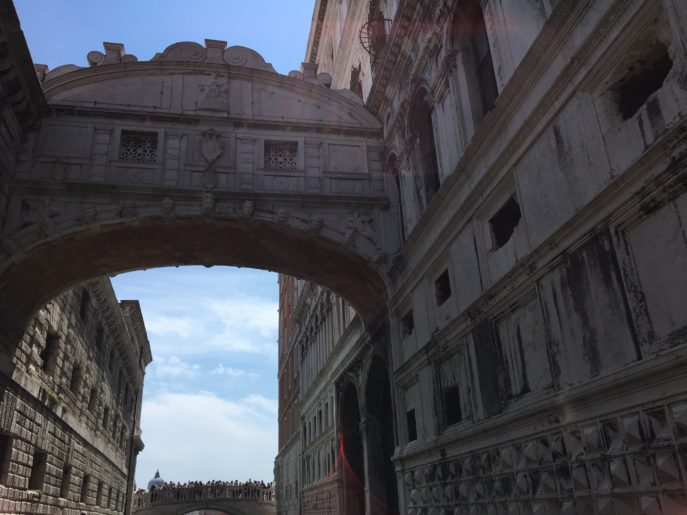
Passing under the Bridge of Sighs was a solemn moment. It is said that Casanova was one of the prisoners who sighed while crossing from the Hall of Magistrates to the prison on the other side. The glimpse of blue sky beyond was the last view of clouds and sun the prisoners would see for some time. (But Casanova escaped in 1756, slipping out of his cell into the palace, where a guard let him out. A happy ending!)

The last time Frank and I were in Venice, we were here to oversee the printing of my interior design book, Comfort Zone: Creating the Eco-Elegant Interior. We met my London-based book designer, Stafford Cliff, in Padua where the printer was located, but were able to take in a bit of Venice before we returned home to the states. That was a working vacation, though, which is a contradiction in terms!
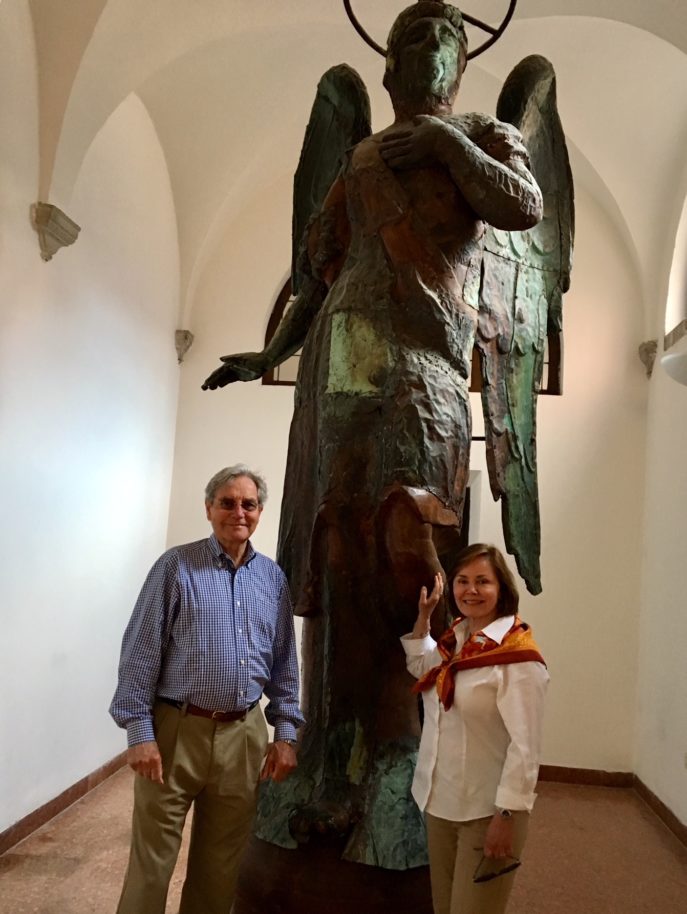
Socrates said that the unexamined life is not worth living. I think that the world must be examined, too. Luckily, we don’t need to travel to Italy, or to France, to find inspiration. It’s all around us. We just have to look for the angels of beauty that are everywhere, and remember we are blessed. (This angel can be found in the Church of San Giorgio Maggiore, in Venice).
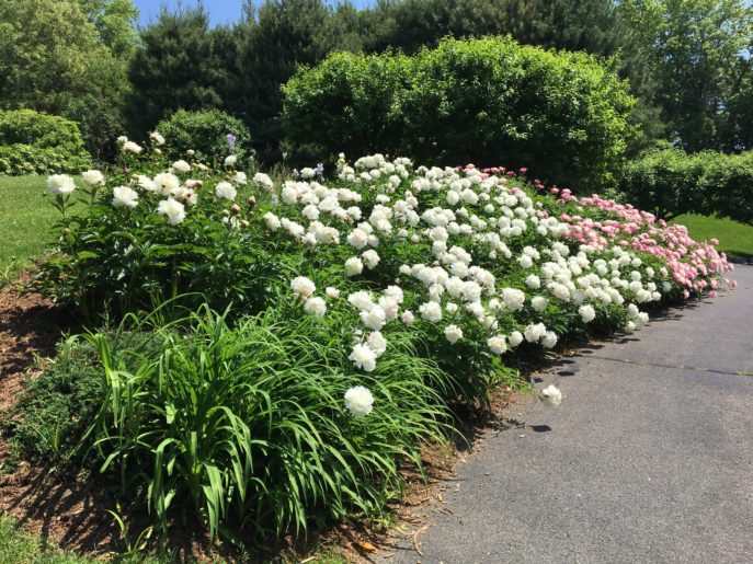
Like Casanova, we had a happy ending too: we made it home in time for the Peony festival in our own front yard. So we had a glass of wine to celebrate.

Saluti!

